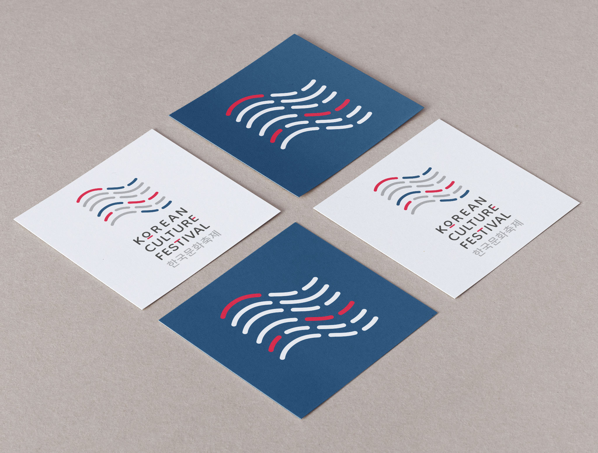

Korean Culture Festival logotype
Sometimes the most interesting design briefs aren't about starting from scratch, they're about honoring what already works and improving what doesn't.
This was the case with Korean Culture Festival's logotype. Their previous mark had served them well for years, but for this year's festival, the Korean Cultural Centre reached out to me for a new version. My task was to design something genuinely flexible, a logotype that would hold up on a 9-meter backdrop just as well as on a business card, while keeping the recognition of the old logo, and keeping the style unmistakably Korean.
I was inspired by the Taegeukgi, the Korean national flag, and the geometric patterns rooted in Korean tradition and still visible throughout Korean architecture. The four trigrams from the flag (geon gon gam ri) became the foundation of a new symbol: shaped into a wave-like, flag-inspired pattern that echoes the old logo's silhouette, built as a proper scalable system rather than a fixed image. Paired with Hangul lettering, the identity stays distinctly Korean at every size and application, from favicon to festival banner.

Korean Culture Festival took place on 22 August at Kungsträdgården in Stockholm, and it was incredible to see the new logotype out in the world, on the stage backdrop and across all the festival's material. An estimated 30,000 visitors passed through throughout the day.
“It was a pleasure working with Julia. From the outset, she walked me through her process and listened carefully to my expectations. Despite a tight schedule, Julia made sure every element of the design reflected exactly what I had envisioned, and delivered the final product on time. I'm delighted with the result and would gladly work with her again on future projects.”
— Inhee SEO, Senior Project Manager, Koreanskt Kulturcenter
DATE
June 2026
ROLE
Graphic designer
CLIENT
Korean Cultural Centre Sweden
PROJECT TYPE
Graphic design, logotype